This page demonstrates Python tips and tricks that I use in my everyday programming as an atmospheric science graduate student.
-Brian Blaylock

Friday, November 11, 2016

Verifying GFS dewpoint data with MesoWest observations

For a class assignment, I needed to verify GFS model output with MesoWest data. I used pygrib to read in the grib file, then used some custom functions that grab data from the MesoWest API.

Here is the output figures and my code.


The output:


gist:

Thursday, November 3, 2016

Friday, October 21, 2016

Adding fields to a structured numpy array created from genfromtxt

Is it possible to add a new field in a numpy.genfromtxt output? Yes it is. I asked this question on stackoverflow and got an answer that works...
http://stackoverflow.com/questions/40182466/is-it-possible-to-add-a-new-field-in-a-numpy-genfromtxt-output/40183748#40183748

The trick is using the numpy.lib.recfunctions library. Use the append_fields function to add a new field to a data structure.


Monday, October 10, 2016

Plotting maps with a loop: Best Practices

Best practices for plotting data on a map with a loop...

If you want to plot many data sets with different times on a base map, only plot the base map once!

Some psudo code:

fig = plt.figure(1)
ax  = fig.add_subplot(111)

## Draw Background basemap
m = Basemap(resolution='i',projection='cyl',\
    llcrnrlon=bot_left_lon,llcrnrlat=bot_left_lat,\
    urcrnrlon=top_right_lon,urcrnrlat=top_right_lat,)
m.drawcoastlines()
m.drawcountries()
m.drawcounties()
m.drawstates()

# Brackground image from GIS
m.arcgisimage(service='NatGeo_World_Map', xpixels = 1000, dpi=100)

# Add a shape file for Fire perimiter
p4 = m.readshapefile('/uufs/chpc.utah.edu/common/home/u0553130/fire_shape/perim_'+perimiter,'perim',drawbounds=False)

# Plot station locations
m.scatter(lons,lats)
plt.text(lons[0],lats[0],stnid[0])
plt.text(lons[1],lats[1],stnid[1])

for analysis_h in range(1,5):

    # code to get lat/lon and data

    # plot pcolormesh, and colorbar
    PC = m.pcolormesh(lon,lat,data)
    cbar = plt.colorbar(orientation='horizontal',pad=0.05,shrink=.8,ticks=range(0,80,5))

    # plot contour
    CC = m.contour(lon,lat,data)


    # plot HRRR 10-m winds
    WB = m.barbs(lon,lat,u,v,)
    

    ### Before you plot the next loop, remove the data plots
    cbar.remove()                  # remove colorbar
    PC.remove()                    # remove pcolomesh
    WB[0].remove()              #remove wind barbs
    WB[1].remove()              #   (takes two steps)
    for cc in CC.collections:  #remove each line in the contour collection
        cc.remove()

Thursday, October 6, 2016

Plot NEXRAD Level II Data with MetPy

Plotting NEXRAD Level II data is possible using MetPy.

View my script here: https://github.com/blaylockbk/Ute_other/blob/master/plot_NEXRAD_II_data.py

Example:


Plotting the fire perimeter from a shape file

There is very useful documentation related to plotting shape files on a basemap here: http://basemaptutorial.readthedocs.io/en/latest/shapefile.html

I needed to plot fire perimeter, plotted on this map of Idaho and shaded in red, on a basemap.
This is how I did it...

from matplotlib.patches import Polygon
from matplotlib.collections import PatchCollection
## My file 
# Plot Fire Perimeter                               
perimiter = '160806'
p4 = m.readshapefile('[PATH]/perim_'+perimiter,'perim',drawbounds=False)
                           
patches   = []
for info, shape in zip(m.perim_info, m.perim):
      if info['FIRENAME'] == 'PIONEER' and info['SHAPENUM']==1772:
             x, y = zip(*shape) 
              #print info
              #m.plot(x, y, marker=None,color='maroon',linewidth=2)
              patches.append(Polygon(np.array(shape), True) )
              ax.add_collection(PatchCollection(patches, facecolor= 'maroon', alpha=.65, edgecolor='k', linewidths=1.5, zorder=1))

Friday, September 23, 2016

Python Matplotlib subscript

This is how to add subscripts to a string in your matlab plot
See more here: http://matplotlib.org/users/mathtext.html

plt.scatter(cyr_no80,co2_no80,color='k',marker='+',label='points')
plt.title(r'CO$_2$ Concentration, no 1980s')
plt.ylabel(r'CO$_2$ (ppm)')
plt.xlabel('Year')


Friday, September 9, 2016

Sorting multiple vectors based on one vector sort order

That title was a mouthful. First, I want to sort an array vector. Then I want to sort other vectors with that same sort order.

I have a vector that contain heights, and with that two other vectors with the corresponding temperature and dew point. I want to sort the height array, and sort the temperature and dew point array in the same manner.

height = np.array([10, 50, 20, 30, 60, 20, 80])
temp = np.array([1, 4, 2, 7, 5, 3, 9])
dwpt = np.array([6, 3, 8, 5, 7, 4, 6])

First, use np.argsort to get the sort order.

sort_order = np.argsort(height)

[out] array([0, 2, 5, 3, 1, 4, 6], dtype=int64)

Now make new arrays of the sorted data with that sort order

sorted_height = np.array(height)[sort_order]
[out] array([10, 20, 20, 30, 50, 60, 80])

sorted_temp = np.array(temp)[sort_order]
[out] array([1, 2, 3, 7, 4, 5, 9])

sorted_dwpt = np.array(dwpt)[sort_order]
[out] array([6, 8, 4, 5, 3, 7, 6])

Thus, you see that we have sorted the height array from lowest to highest, and the temperature and dew point arrays have been sorted, preserving their order with the corresponding height.

Tuesday, August 30, 2016

Dealing with python datetime arrays

Sometimes it's a pain that you can't perform datetime operations on each element of a numpy array. Here are a couple tipes

1. List of a range of datetime objects

The best way to make a list of datetime objects or numpy array is to use this tip:


which creates a list of datetime objects from today going back a day until it hits the number of days range limit. You can change the - to a + to increment one day in the future, or change the days argument to hours, etc.

2. Convert list of datetime strings to python datetime objects

When you read in date and time data from a file, it will often come in as a string. Often, you'll read these in as a list. To convert that list of strings to a list of python datetime objects do this:

3. Convert list of epoch times to python datetime objects


Alternatively, if the dates come in as a list of epoch times, use this...


4. Convert list of datetime strings to python datetime objects using a numpy vectorized function

This method is slightly appears to be slightly faster than method discussed in 2.


In the past I would create an empty array and append to it with a for loop like this...
but this method takes longer to compute, especially for long arrays.

Monday, August 29, 2016

Decoding Rawinsonde Sounding Observations

Have you ever seen upper air sounding data that looks like this...I'm trying to write a Python script to decode this kind of stuff. I'm not sure what to make of this or how the best way to decode it is.
There are some hints here: http://www.ofcm.gov/fmh3/pdf/13-app-e.pdf
and here: http://www.meteor.iastate.edu/classes/mt311/extras/Codul-TEMP.pdf
and here: http://www.rwic.und.edu/metresources/raob.html

USUS41 KWBC 191400

IIAA USBOI02 69144 99441 71160 15645 09333

99910 12464 00000 00144 ///// ///// 92796 ///// ///// 85536

18876 01008 70162 10476 34521 50588 07170 33030 40756 20769

33043

88999

77999

31313 40708 81429=

NNNN

UMUS41 KWBC 191400

IIBB USBOI02 69148 99441 71160 15645 09333

00910 12464 11870 18073 22813 18477 33808 18278 44727 10874

55694 10476 66590 00468 77501 06969 88387 22969

21212 11910 00000 22840 01010 33795 05010 44712 36019 55712

36019 66641 31518 77449 34038 88387 33041

31313 40708 81429

41414 /////

21212 11910 00000 22840 01010 33795 05010 44712 36019 55712

36019 66641 31518 77449 34038 88387 33041=

NNNN

Tuesday, August 2, 2016

Find the nearest latitude and longitude grid box for a point

🐍 An updated notebook is available for this demonstration on GitHub.

Also look at my demonstration using the KDTree method (scipy.spatial.KDTree.query) to find nearest neighbor for many points.


I deal a lot with weather model output (specifically HRRR model data) and often need to verify a data point with observational data. Weather stations we get observations from are not located at the exact grid points as the model's grid points. The hard part is finding the index value of a latitude and longitude grid point nearest to the observation location. This is made easy with numpy's maximum function (not max).

First, you need to have three arrays, one for latitude, one for longitude, and one for the environment variable such as temperature. Load these values into a numpy array. I use pygrib to read model output in grib2 format.

lat = latitude  # a 2D numpy array of your latitudes
lon = longitude # a 2D numpy array of your longitudes
temp = temperature # a 2D numpy array of your temperatures, or other variable

Next you need to know the latitude and longitude for the observation point. We are looking for the nearest grid point in the lat and lon arrays for that grid point.

stn_lat = station's latitude # eg. 40
stn_lon = station's longitude # eg. -110

Now find the absolute value of the difference between the  station's lat/lon with every point in the grid. This tells us how close a point is to the particular latitude and longitude.

abslat = np.abs(lat-stn_lat)
abslon= np.abs(lon-stn_lon)

If you plot abslat and abslon, you'll see what we have done...we have created two new arrays with that tell us how close each latitude and longitude is to the grid point we are interested in.
abslat: the blue line represents the nearest grid latitude line our station is located.
abslon: the blue line represents the nearest grid longitude our station is located.
Now we need to combine these two results.
We will use numpy.maximum, which takes two arrays and finds the local maximum.

c = np.maximum(abslon,abslat)

Which is an array that looks like this...
c: an array expressing the local maximums between the abslat and abslon arrays
The dark blue point is the nearest grid location to our station. You can find the index location on the grid of this by using the min function.

latlon_idx = np.argmin(c)

Now, this latitude/longitude index value is the index for a flattened array, so when you look for that same index value in, say, your temperature array, you should flatten the array to pluck out the value at that point.

grid_temp = temp.flat[latlon_idx]

If you don't like flattened arrays, you can also get the row/column index like this
x, y = np.where(c == np.min(c))
grid_temp = temp[x[0], y[0]

And there you have it!

Python Matplotlib Superscript

In scientific notation it is more proper to express fractional units with superscipts like ms^-1 instead of m/s.  To do this in labels in python's Matplotlib there is some special formating you need to do...

plt.ylabel(r'Wind Speed (ms$\mathregular{^{-1}}$)')

this will print "Wind Speed (ms^-1)" with the -1 as a superscript on the ylabel. The \mathregular expression makes the font not a fancy italic font. See here: http://stackoverflow.com/questions/21226868/superscript-in-python-plots


Friday, July 1, 2016

Plotting radar data with MetPy, pyproj, Basemap

MetPy radar plots

The MetPy python package is really helpful for atmospheric scientists which allows you to plot radar data (specifically Level 3 data) downloaded from the THREDDS server whose files are in the .nids format. How to use MetPy to plot these data is explained on the MetPy docs, and you'll create a plots of reflectivity and radial velocity like this...
There are two things the example doesn't tell you...

1) The data value units are arbitrary. Notice that the values of dbz color scale is the same as the values in the radial velocity scale on the right. What the MetPy example doesn't tell you is that you need to use the map_data instance to convert the data to appropriate units.

f = Level3File(FILE)

# Pull the data out of the file object (this stuff is in 8-bit)
datadict = f.sym_block[0][0]

# Turn into an array, then mask
data = f.map_data(datadict['data']) # I'm confident this maps the data to floats with units of m/s
data = ma.array(data)
data[np.isnan(data)] = ma.masked

2) You don't get a sense of where the radar and its observations are located in relation to places, just a distance from the center. You can convert the azimuth and range into a latitude and longitude by using the pyproj module. Then you can use the lon and lat variables to plot the data on a basemap. Given the center latitude, center longitude, azimuth (degrees from north), and the range from center lat/lon, you can calculate the latitude and longitude of a distant point like this...

from pyproj import Geod

# Grab azimuths and calculate a range based on number of gates
az = np.array(datadict['start_az'] + [datadict['end_az'][-1]])
rng = np.linspace(0, f.max_range, data.shape[-1] + 1)

# Convert az, range to a lat/lon
g = Geod(ellps='clrk66') # This is the type of ellipse the earth is projected on. 
                         # There are other types of ellipses you can use,
                         # but the differences will be small
center_lat = np.ones([len(az),len(rng)])*f.lat    
center_lon = np.ones([len(az),len(rng)])*f.lon
az2D = np.ones_like(center_lat)*az[:,None]
rng2D = np.ones_like(center_lat)*np.transpose(rng[:,None])*1000
lon,lat,back=g.fwd(center_lon,center_lat,az2D,rng2D)
#...(add code to create map)
m.pcolormesh(lon,lat,data,cmap="BrBG_r",vmax=10,vmin=-10)

You can replace the xlocs and ylocs in the MetPy example with the lon and lat variables, and use those lons/lats to plot on a basemap.
(Note: back_az is the azimuth from the point back to the center location)

TDWR plot on Basemap

I like to look at the TDWR base radial velocity scans to look for lake breezes in the Salt Lake Valley. Below is plotted the radial velocity on June 19, 2015 at 00:24 UTC using MetPy without converting to correct units using map_data and has not been plotted on a basemap (two color schemes used).
both plots are the same, but the color bar is different.
It is so much nicer to view radar data on a basemap plot, as shown below, so you get a sense of there the observations are in space. You can see a lake breeze boundary in the center of the valley (below center of the image where color changes from dark green to light green). I have also used the map_data instance to covert the data to units of ms-1. Each plot is the same with different color schemes. Left is the Brown/BlueGreen that I like, and right is the NWS Red/Green scheme built into MetPy.
 

The full code to do this is on github:
Plotting TDWR Radar data:
https://github.com/blaylockbk/pyBKB_v2/blob/master/TDWR/plot_TDWR_reflectivity.py
Plotting NEXRAD Level 2 data:

Extra things you can put on the map are a shape file of the roads, and weather observations from the MesoWest API. Let me know if you find this useful :)

Wednesday, June 29, 2016

Plot a psudo-sounding with MesoWest Data

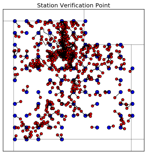
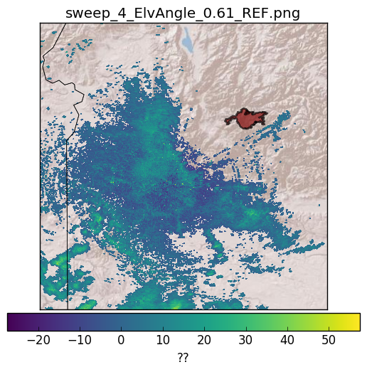
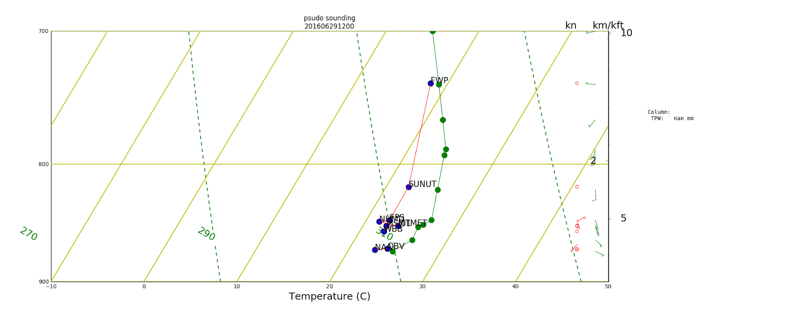
In the Salt Lake City area there are many weather stations at elevations higher than the valley floor. Farnsworth Peak is such a weather station at almost 700 hPa. I wondered what it would look like to plot station weather data on a skew-t graph, and see how it compares to rawinsonde balloons.

Here I use the MesoWest API and the Wyoming Sounding data to plot these graphs. I use the SkewT 1.1.0 module for Python to create the SkewT graph. The balloon observations are in green and the real observations are plotted in blue with the station id next to the point. A red line is drawn to create the "psudo-sounding" from the temperature observations at the different elevations. It doesn't match up exactly, except, for FWP, which seems to be an accurate representation of the temperatures of the atmosphere at that elevation.


## Brian Blaylock
## 27 June 2016

# A lot of the stations in Utah are at elevations.
# I want to plot station data on a skew-t graph to get a 
# psudo vertical profile for any time of day.

import matplotlib.pyplot as plt
import numpy as np
from datetime import datetime, timedelta

import sys
sys.path.append('B:\pyBKB')                                        #for running on PC (B:\ is my network drive)

from BB_MesoWest import MesoWest_stations_radius as MW
from skewt_900_700 import SkewT #this version plots between 900-700 hPa
import wyoming_sounding

##############################

request_time = datetime(2016,6,29,12,0)

##############################

MWdatetime = request_time.strftime('%Y%m%d%H%M')
a = MW.get_mesowest_radius_winds(MWdatetime,'10')

p = a['PRESS']>0 #pressure is in these indexes
pres = a['PRESS'][p]/100
temp = a['TEMP'][p]
hght = a['ELEVATION'][p]
dwpt = a['TEMP'][p]*np.nan #don't get the dewpoint now
wd   = a['WIND_DIR'][p]
ws   = a['WIND_SPEED'][p]
stns = a['STNID'][p]

# sort all that data based on pressure
from operator import itemgetter
pres,temp,hght,dwpt,wd,ws,stns = zip(*sorted(zip(pres,temp,hght,dwpt,wd,ws,stns),key=itemgetter(0)))


data = {'drct':wd,
        'dwpt':dwpt,        #don't plot dwpt right now
        'hght':hght,
        'pres':pres,
        'sknt':ws,
        'temp':temp}
S=SkewT.Sounding(soundingdata=data)

S.plot_skewt(title='psudo sounding\n'+MWdatetime,color='r',lw=.8,parcel_type=None,
             pmin=700.,pmax=900.)

for i in range(0,len(stns)):
    if temp[i]>0: #wont accept nan values
        print temp[i],pres[i],stns[i]
        S.plot_point(temp[i],pres[i])
        S.plot_text(temp[i],pres[i],str(stns[i]))
        
# Add real sounding to plot

# If request_time is in the afternoon, then request the evening sounding
if request_time.hour > 18:
    # Get the evening sounding (00 UTC) for the next day
    next_day = request_time + timedelta(days=1)
    request_sounding = datetime(next_day.year,next_day.month,next_day.day,0)    
elif request_time.hour < 6:
    # Get the evening sounding (00 UTC) for the same
    request_sounding = datetime(request_time.year,request_time.month,request_time.day,0)    
else:
    # Get the morning sounding (12 UTC) for the same day
    request_sounding = datetime(request_time.year,request_time.month,request_time.day,12)

print "SLC sounding for", request_sounding

a = wyoming_sounding.get_sounding(request_sounding)
balloon = {'drct':a['wdir'],
           #'dwpt':a['dwpt'],
           'hght':a['height'],
           'pres':a['press'],
           'sknt':a['wspd'],
           'temp':a['temp']}
# Add to plot
T = SkewT.Sounding(soundingdata=balloon)
S.soundingdata=T.soundingdata
S.add_profile(color='g',lw=.9,bloc=1.2)


Tuesday, June 14, 2016

WRF Browser for Windows

Again, not a python post, but some good news for WRF modelers who use Windows PCs.


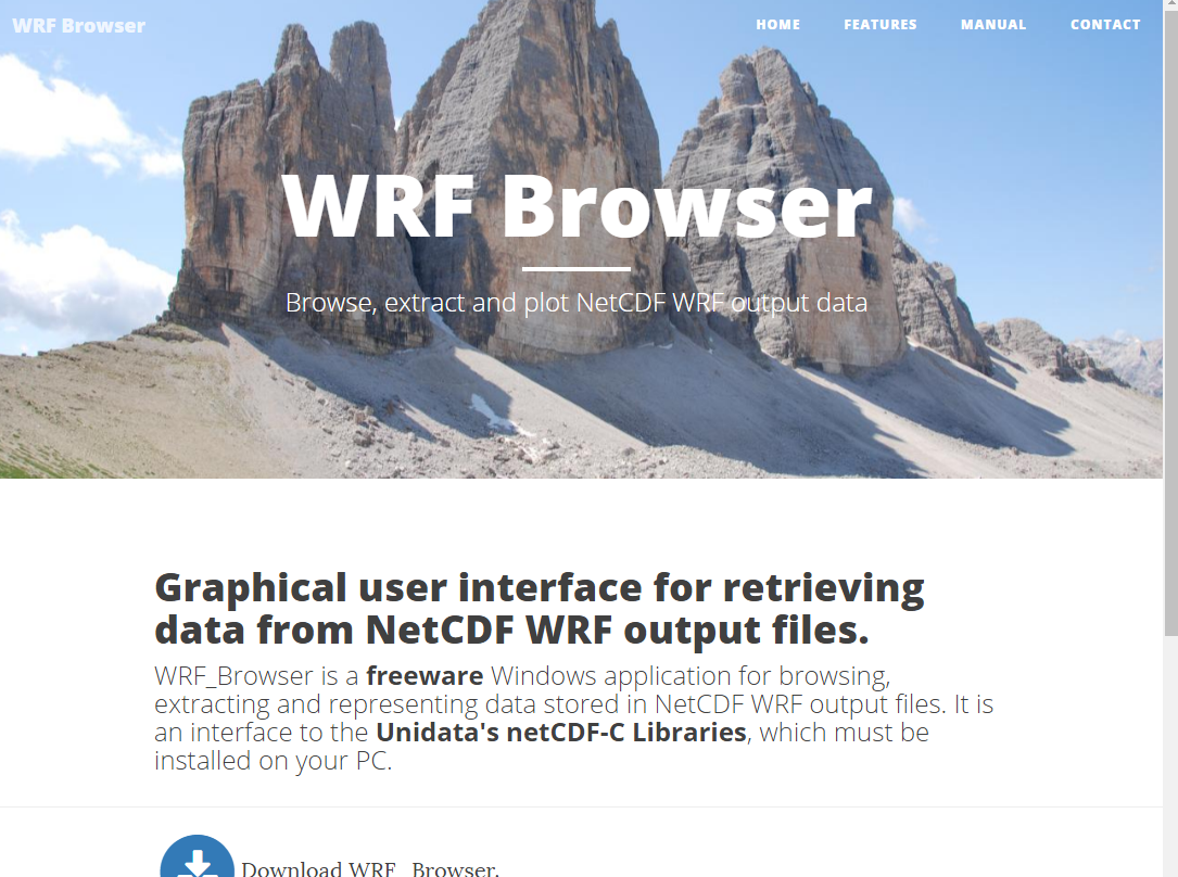
Introducing WRF Browser, a Windows application you can load and view WRF output and netcdf variables on a map or export to CSV. http://www.enviroware.com/WRF_Browser/
A few tips unique to my needs:
1) I like to look at terrain and land use fields. This is especially nice when you can do this on Google Earth. You'll need to create your own colormap, or as they call it "ColorRamp". Follow the directions in the online manual for creating a custom colormap. I've made one called MODIS_21_Landuse.pg and put it in the directory C:\ProgramData\Enviroware\WRF_Browser\ColorRamps\ 

This matches my Python ColorMap for MODIS land use

1         0 102   0 255

2         0 102  51 255
3        51 204  51 255
4        51 204 102 255
5        51 153  51 255
6        76 178   0 255
7       209 104  31 255
8       188 181 105 255
9       255 214   0 255
10        0 255   0 255
11        0 255 255 255
12      255 255   0 255
13      255   0   0 255
14      178 230  77 255
15      255 255 255 255
16      233 233 179 255
17      127 178 255 255
18      219  20  59 255
19      247 127  80 255
20      232 150 122 255
21        0   0 224 255


The KML output looks like this...
This is the same land use scheme used in the HRRR model, except that the Size of the Great Salt Lake has been modified to it's present day lake level.
One thing I notice is that urban sprawl in the southern end of Utah County in Spanish Fork (my hometown), Salem, and Payson is not captured in the MODIS land use categories. This may have some small effects on how well the HRRR produces forecasts in these cities (as far as I can tell, land use and surface characteristics for a city is a minor issue with the HRRR compared to it's other problems).

Thursday, May 26, 2016

Spanish Fork Climatology

I just used the MesoWest API to create a climatology of weather variables at my weather station in Spanish Fork. This shows the max, mean, and min values for various variables of each month of the year. The data collected ranges from  2013 to 2016.

See code: https://github.com/blaylockbk/Ute_MesoWest/blob/master/station_month_climatology.py
The freezing temperature is marked in a dashed light blue.


And looking at the daily averages (again this is only a few years of data, so in no way an official "climatological" average of temperature on each day)

See code: https://github.com/blaylockbk/Ute_MesoWest/blob/master/station_day_climatology.py
We haven't had a day below freezing after the first few days of May.


Tuesday, May 24, 2016

MetPy pythons gift to meteorologists :)

HRRR 700mb wind field and vorticity over Utah

I just installed MetPy and started using it to calculate and plot maps of HRRR vorticity! This will be a very useful package in the future :)

HRRR 700 mb winds and vorticity over Utah

Monday, May 23, 2016

Edit netCDF files with Photoshop

http://home.chpc.utah.edu/~u0553130/Brian_Blaylock/lake_surgery.html#PHOTO

I always thought it would be nice if I could load a netCDF file into photoshop and make changes to fields with the paint brush and pencil tool.
Well, now you can, with this three step process using Python (this only works with landuse or categorical data sets so far).
This is a work in progress and will get more attention after I defend my thesis, but it's a really handy concept.
  1. Convert a netCDF array into a bitmap image netcdf_to_bitmap.py.
  2. Open image in PhotoShop and use the pencil tool to change colors (i.e. land use categories). Save image as bitmap.
  3. Open the modified land use image in Python bitmap_to_netcdf.py. and extract the colors as categories. Save array into the WRF netCDF file

Below you can see that I added more lake and urban area using the pencil tool to the WRF landuse array.

Thursday, May 19, 2016

www.pytroll.org

A python library for dealing with Satellite data. I haven't used this, but might find it useful in the future.

http://www.pytroll.org/

Tuesday, May 17, 2016

Date incrementor in JavaScript

I know, this isn't Python, this is JavaScript, but I need to back up this code snippet.

I have an HTML page with a date input box that I need to increment by one day forward or backward. See example here: http://home.chpc.utah.edu/~u0553130/Brian_Blaylock/ksl_ozone_viewer.php

So, I here are some JavaScript functions that change the date input +/- one day.

function pad(number, length) {
    //I just use this to pad the day or month integer with zeros
    var str = '' + number;
    while (str.length < length) {
        str = '0' + str;
    }
    return str;
}

function next_day(){
    //                    dec   jan   feb   mar   arp   may   jun   jul   aug   set   oct   nov   dec   jan
    var days_per_month = ["31", "31", "28", "31", "30", "31", "30", "31", "31", "30", "31", "30", "31", "31"];
    
    year = parseInt(document.getElementById('dateinput').value.slice(0,4));
    month = parseInt(document.getElementById('dateinput').value.slice(5,7));
    day = parseInt(document.getElementById('dateinput').value.slice(8,10));
        
    if (day < parseInt(days_per_month[month])){
       day = day+1; 
       day = pad(day,2);
       month = pad(month,2);
        }
    else{
        day = '01';
         if (month==12){
            month = '01';
            year = year +1
            year = pad(year,4)
         }
         else{
            month = month + 1;
            month = pad(month,2);     
         }
        
    }
    
    
    document.getElementById('dateinput').value = year+'-'+month+'-'+day
}

function previous_day(){
    //                    dec   jan   feb   mar   arp   may   jun   jul   aug   set   oct   nov   dec
    var days_per_month = ["31", "31", "28", "31", "30", "31", "30", "31", "31", "30", "31", "30", "31"];
    
    year = parseInt(document.getElementById('dateinput').value.slice(0,4));
    month = parseInt(document.getElementById('dateinput').value.slice(5,7));
    day = parseInt(document.getElementById('dateinput').value.slice(8,10));
    
    if (day == 1){
       day = days_per_month[month-1];
        if (month==1){
            month = '12';
            year = year -1
            year = pad(year,4)
        }
        else{
          month = month-1;
           month = pad(month,2);     
        }
       
    }
    else{
        day = day-1;
        day = pad(day,2);
        month = pad(month,2);
    }
    
    
    document.getElementById('dateinput').value = year+'-'+month+'-'+day;

}

Note: this doesn't allow for a leap year date.

Friday, May 13, 2016

Python Matplotlib available colors

Python's matplotlib defines a bunch of colors you can use in you plots. The way colors look on a computer screen looks different than how it looks when you print it, so you can print out the following page as a reference to what colors are available and what they really look like when printed.

Created using a script from http://stackoverflow.com/questions/22408237/named-colors-in-matplotlib

# plot python colors for printing

import matplotlib.pyplot as plt
import matplotlib.patches as patches
import matplotlib.colors as colors
import math
import matplotlib
for name, hex in matplotlib.colors.cnames.iteritems():
    print(name, hex)
    
width= 8
height= 11

fig = plt.figure(figsize=(width,height))
ax = fig.add_subplot(111)

ratio = 1.0 / 3.0
count = math.ceil(math.sqrt(len(colors.cnames)))
print count
x_count = count * ratio
y_count = count / ratio
x = 0
y = 0
w = 1 / x_count
h = 1 / y_count

for c in sorted(colors.cnames):
    pos = (x / x_count, y / y_count)
    ax.add_patch(patches.Rectangle(pos, w, h, color=c))
    ax.annotate(c, xy=pos,fontsize=10)
    if y >= y_count-1:
        x += 1
        y = 0
    else:
        y += 1
        

plt.yticks([])
plt.xticks([])
plt.savefig('allcolors',bbox_inches='tight',dpi=300)
#plt.show()

Friday, April 29, 2016

Python Basemap Background Image from ArcGIS MapServer

Click here for Jupyter Notebook

https://github.com/blaylockbk/pyBKB_v2/blob/master/demos/add_arcgis_image_to_basemap.ipynb
Python's Basemap toolkit has some default backgrounds you can load. To draw the background on your map you use m.bluemarble(), and m.shadedrelief(). These are really low resolution, so they aren't very useful if you zoom in on a specific area.

Alternatively, you can download higher resolution maps from the ArcGIS maps server. Here's how...
m.arcgisimage(service=maps, xpixels = 3500, dpi=500, verbose= True)

For the Salt Lake Valley, here's what each of the map backgrounds look like. You can plot anything on top of this :) 


To plot all of the availble maps I've made this script:
import matplotlib.pyplot as plt
import numpy as np
from functions_domains_models import *

from mpl_toolkits.basemap import Basemap


# Define the map boundaries lat/lon
domain = get_domain('salt_lake_valley')
top_right_lat = domain['top_right_lat']+.1
top_right_lon = domain['top_right_lon']-.1
bot_left_lat = domain['bot_left_lat']
bot_left_lon = domain['bot_left_lon']

## Map in cylindrical projection (data points may apear skewed)
m = Basemap(resolution='i',projection='cyl',\
    llcrnrlon=bot_left_lon,llcrnrlat=bot_left_lat,\
    urcrnrlon=top_right_lon,urcrnrlat=top_right_lat,)


map_list = [
'ESRI_Imagery_World_2D',    # 0
'ESRI_StreetMap_World_2D',  # 1
'NatGeo_World_Map',         # 2
'NGS_Topo_US_2D',           # 3
#'Ocean_Basemap',            # 4
'USA_Topo_Maps',            # 5
'World_Imagery',            # 6
'World_Physical_Map',       # 7     Still blurry
'World_Shaded_Relief',      # 8
'World_Street_Map',         # 9
'World_Terrain_Base',       # 10
'World_Topo_Map'            # 11
]

for maps in map_list: 
    plt.figure(figsize=[10,20])    
    ## Instead of using WRF terrain fields you can get a high resolution image from ESRI
    m.arcgisimage(service=maps, xpixels = 3500, dpi=500, verbose= True)
    m.drawstates()
    plt.title(maps)
    
    plt.savefig('00'+maps,bbox_inches="tight")