

Friday, November 22, 2013
Python Skew_T
November 21 to 23, 2012 was a downslope windstorm that affected the Wasatch Front from Salt Lake City to Ogden. I helped launch several weather balloons during the event from the Bountiful Bench, right below the "B" on the mountain. Anyways, I wanted to use Python to plot the data on a Skew-T, Log-P chart. I don't claim to be the best programmer. In fact, the basics often slip my mind. After sifting through several different scripts on the internet I found this one, and modified it to make it work. There is a better way to do this, so I'll figure out how to do that someday. I'd like to put wind barbs on the side as well. Wind speeds are important to these soundings, especially when you want to study the downslope windstorms.

Wednesday, October 23, 2013
Simple file import using Numpy's "genfromtxt" function
I've always had trouble importing data into Python the way I want it. I like to use numpy's genfromtxt function because it is simple and useful. However, for long data sets this import method can take a long time. Anyways, here are some attributes of numpy.genfromtxt you should keep in mind:
- Choose the right delimiter. The comma (,) is used quite often.
- Choose a data type. The default is "float". When there are mixed data types use "None"
- If there are column names it is useful to choose "names=True". This makes it easy to reference columns in the data set.
Here is an example:
I downloaded weather data from Mesowest and saved it in a file called "WBB_2013.txt". It looks like this:
MON,DAY,YEAR,HR,MIN,TMZN,TMPF,RELH,SKNT,GUST,DRCT,QFLG,PRES,SOLR,PREC,P05I,VOLT,DWPF
10,23,2013, 13,45,MDT, 62.1,32,3.9,9.2,283,2,25.30,610.9,,0.00,13.03,39.1
10,23,2013, 13,40,MDT, 61.9,32,4.8,9.6,285,2,25.30,615.7,,0.00,13.00,38.7
10,23,2013, 13,35,MDT, 62.2,31,4.4,13.2,252,2,25.30,618.6,,0.00,13.04,38.7
10,23,2013, 13,30,MDT, 61.7,31,4.1,9.0,257,2,25.30,619.4,,0.00,13.00,37.9
...etc.
The first row is the name of each variable--the "title" of the column. To import this data into Python I can use the following statement:
data = np.genfromtxt('WBB_2013.txt', delimiter = ',', dtype=None, names=True)
Here I have specified the file name, delimiter = ',', the data type as None dtype=None (because the timezone is a string while the others are floats), and set names = True so that I can reference columns by the name in the first line.
I can now access each column as follows:
- Month = data['MON']
- Day = data['DAY']
- Temperature_F = data['TMPF']
- etc.
Monday, August 5, 2013
Meteolib
Meteolib is a useful package for doing calculations with weather data. The script is found here.
I have found windvec very useful for averaging wind speeds and wind directions. Wind direction is difficult to average because when you average NW and NE winds by the number of degrees it averages to a South wind, and that is not correct. The function windvec will give you the correct vector averaged wind direction.
I have found windvec very useful for averaging wind speeds and wind directions. Wind direction is difficult to average because when you average NW and NE winds by the number of degrees it averages to a South wind, and that is not correct. The function windvec will give you the correct vector averaged wind direction.
Saturday, August 3, 2013
Basemap Resolution
I participated in NASA's Student Airborne Research Program during the summer of 2013. A total of 31 students, including myself, participated in the program. We worked on the DC-8 flying laboratory and flew about 4,600 miles all over California. With the data we collected on the plane, each student worked on an individual research project. I was determined to do all my data analysis using Python. One useful tool was the basemap library.
The basemap toolkit allows programmers to draw maps and plot information on the map. I quickly learned that maps can be drawn at various resolutions: crude (c), low (l), intermediate (i), high (h), and full (f). Maps with higher resolution take more computing power and take longer to draw. Below is a comparison of the quality of each map resolution showing Southern California.
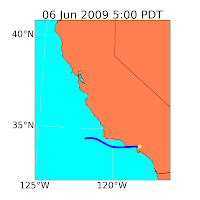
 On these maps I could add color, latitude and longitude lines, and finally plot data. Shown below is data from the Air Resources Labratory HYSPLIT model showing a 24-hour backward trajectories for Los Angeles on the days shown below. The star is downtown LA and the blue path shows the travel path of an air parcel in LA at the given date and time.


The basemap toolkit allows programmers to draw maps and plot information on the map. I quickly learned that maps can be drawn at various resolutions: crude (c), low (l), intermediate (i), high (h), and full (f). Maps with higher resolution take more computing power and take longer to draw. Below is a comparison of the quality of each map resolution showing Southern California.


Wind Rose
I found some code online to plot a wind rose. I used data from the my personal weather station to plot wind direction, frequency, and speed on this beautiful wind rose.

I participated in NASA's Student Airborne Research Program in 2013. I studied weather influences on air pollution in the Los Angeles area. As part of my project I made the following pollution rose plots. They are similar to the wind rose shown above, but these only show the wind direction at the daily maximum ozone concentration. Plotted is every day between April 1 and September 30 between 2008 and 2012. It is colored by the max ozone concentration for that day.

I participated in NASA's Student Airborne Research Program in 2013. I studied weather influences on air pollution in the Los Angeles area. As part of my project I made the following pollution rose plots. They are similar to the wind rose shown above, but these only show the wind direction at the daily maximum ozone concentration. Plotted is every day between April 1 and September 30 between 2008 and 2012. It is colored by the max ozone concentration for that day.
 |
| Costa Mesa |
") |
| Los Angeles (Main Street) |
 |
| San Bernardino |
 |
| Santa Clarita |

Subscribe to:
Posts (Atom)